3D tutorials, tips and techniques, inspiration and community.

Thursday, February 23, 2012

Positioning the Camera in Blender the Pro Way

In this quick tip, I'd like to explain a little Blender feature that apparently is not widely used. I find it incredibly powerful, to the extent that I think it should be the default behavior.

Oftentimes, while watching other people's workflow in Blender, I get the impression that the most common way to frame a shot is by going into Camera view, selecting the camera itself, pressing G or R, plus a specific key for each axis (X, Y, Z) in order to move or rotate the camera itself. Alternatively, one can press Shift-F to go into Fly Navigation mode. However, I really never liked Fly Navigation mode. I find it hard to control. Neither of these methods is, in my opinion, great.

There is a third way that lets you fine tune the position of the camera intuitively—without leaving Camera view. In order to access this option, you need to press N with the pointer in the 3D View to access the Properties side panel. Then, under the View tab, click on the Lock Camera to View option to activate it.

Click on Lock to Camera View to activate this option.
Once you select that option, make sure you're in Camera view. You'll notice that the camera limits become red, indicating that your camera is ‘locked to the view’. Go ahead and use the navigational shortcuts you would use in any other view mode (defined on the Input panel in the Blender Preferences dialog) to move around in Camera mode and frame the shot precisely. You can now zoom, orbit, and pan the same way you‘d do in other views, and the camera adjusts accordingly. Cool stuff.

The camera limits display a red outline. Actually, you don't even have to select
the camera in order for this to work.
Note: Once you're happy with the framing, you could deselect the Lock Camera to View option so that you don't change the shot composition accidentally.

Saturday, February 18, 2012

Dissolving Logo from a tutorial by Blender Diplom

I just found this really great tutorial on Blender Diplom that explains how to create a dissolving logo effect. It's one of the best Blender tutorials I've read so far. It kind or reminds me of some of the effects used in the Harry Potter movies. It's a bit strange-looking, but hey, I am not complaining :)

To go to the Blender Diplom tutorial, click here.


I wonder if I should incorporate this animation into the header of my blog... What do you think?

Friday, February 10, 2012

Mac OSX Sidebar in Blender's File Browser Bookmarks

This is a quick tip for Mac OSX users. The Sidebar on Mac OSX is this area that every Finder window has—that is, if you select View > Show Sidebar on the Finder. In it you can place files, folders, and volumes for easy access, by just dragging them in there. A kind of alias is created on the fly. To remove them, press Command and drag them out of the Sidebar.

For a while, I wondered where the non-removable bookmarks in the Bookmarks panel on Blender's File Browser came from. Of course, you can create your own bookmarks by browsing to a folder and pressing Add. However, there are these other bookmarks I can't remove. Where do they come from?  I just discovered that Blender accesses the items on the Mac OSX Sidebar and places them in the Bookmarks panel in the File Browser. I know it's a silly tip, but it feels good knowing you can control its contents.

This is what my Sidebar looks like.

These are the bookmarks on my File Browser window.
They match the contents in the Sidebar. Notice that Airdrop
is shown as myDocuments.cannedSearch. Also, I'm not exactly
sure how Blender orders the items in the Sidebar...

Thursday, February 9, 2012

Multiple UVs and Decals in Cycles

(Note: I recently published a sort of expanded and updated version of this post. Some—but not all—of the information here has become obsolete in the newer versions of Cycles. However, some of the techniques explained here are still useful. You can find the new post on this link.)

For a while now, Blender has had the option of taking advantage of several UV projections on the same mesh. The different UV projections can be created in the UV Maps panel in the Object Data section of the Properties Editor (figure 1). In order to create a UV map, just click on the + sign in the UV Maps panel. Alternatively, you can select a mesh, go into Edit mode, select the desired polygons to UV map, press U to access the UV mapping floating menu, and choose a UV mapping method. With the second method, Blender creates a UV map by default.

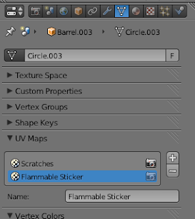
Figure 1. Notice that there are two different UV maps for the same mesh.
Figures 2 and 3 show what they look like.
In order to create additional UV projections, just click again on the + button, and choose a UV mapping method by pressing U while in Edit mode. You can see what the different UV projections look like by opening the UV/Image Editor window. Figures 2 and 3 show the what the two UV maps in this example look like.


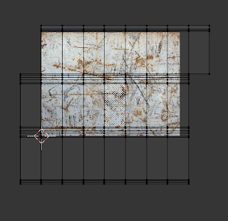
Figure 2. This UV projection corresponds to the Scratches UV map.


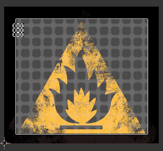
Figure 3. This UV projection corresponds to the Flammable Sticker UV map.

The reason why I explain all this is that, at the time of this writing, Cycles does not have the possibility of stopping the tiling of an image texture over a UV map. Blender Internal has a nice option that forces the texture to not tile. In Cycles, on the other hand, if you need to place decals over a mesh via a texture, you run into the problem that, if you are using more than one texture on your object, but use only one UV map, the decal won't look good at all—multiple copies of it will appear over the mesh, because of the tiling (see figure 4).

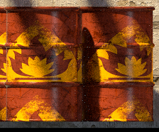
Figure 4. If you use the same UV map on a texture that appears
everywhere on a mesh, you'll get a repeating pattern
for the decal.

The workaround is to use several UV maps, one for each texture. By using the two different UV projections as seen on figure 2 and 3, and applying a different image texture to each, we can control which polygons receive which texture. However, in order to do so, we need to use material nodes, specifically the Attribute node. The Attribute node can be found by switching to the Nodes window. Make sure you're in the Material Nodes section of the Nodes window.

In order to take advantage of the nodes, you first assign a material to your object in the Material pane. The default material will do for now. Then, you switch to the Node window and click on the ball icon to the far left (figure 5).

Figure 5. Make sure that the ball icon is highlighted.
This way, you'll be able to edit material nodes.

In order to add a node, hover the cursor over the Nodes window, and press Shift + A. A floating menu appears which lets you add specific nodes. The Attributed node can be found under Input (figure 6). Your floating menu might look different than the one shown here because Cycles is still under development, and new nodes will most likely keep being added.

Figure 6. Press Shift + A to add a new node.
Go to Input > Attribute to add the Attribute node.

Keep adding nodes as needed, and connect them by dragging from the different input/output sockets as needed. The final setup for using two different UV maps on two different textures should look like the one in figure 7.

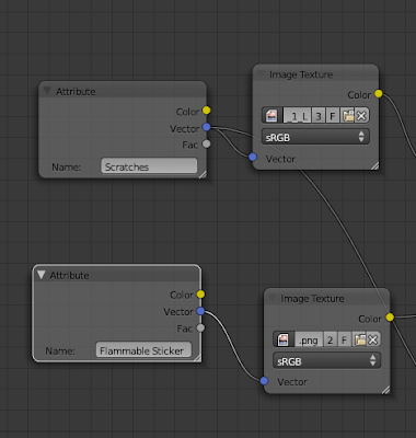
Figure 7. You need to type the exact name of the UV map that controls
the placement of the specific texture on the mesh. Connect the blue output
in the Attribute node with blue input in the Image Texture node.

One final thing that needs to be done is to use a Mix node to combine the two different textures—each with its own UV mapping. Connect the yellow output of each image texture node into one of the two yellow input in the Mix node (figure 8). Additionally, you need to use a third image texture, usually a grayscale version of the sticker image, to block the pixels of one texture from the other. Essentially, this grayscale image texture acts as a mask. I created my own mask by converting the sticker image to grayscale in Photoshop (figure 9). You could also use nodes to do this, specifically by using the RGB to BW Convertor node. In this example, I also needed to invert the texture by using an Invert node. This grayscale image is then fed into the Fac socket in the Mix node.Make sure you select the correct UV mapping for this image as well—in this example it is the same UV map used by the sticker image (flammable_sticker).


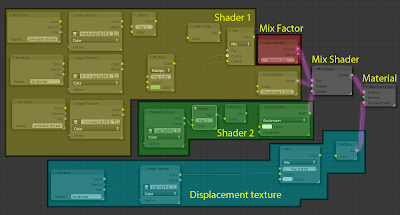
Figure 8. Here is a screenshot of the whole node setup (click to enlarge). Notice that this is a slightly modified example of the whole node setup for the material. The difference is that I end up using a Multiply for the base barrel color to be able to control its hue.


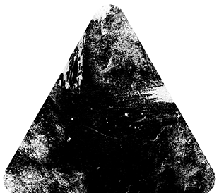
Figure 9. The masking texture.

With the right UV map applied to each image texture, the decal looks fine this time (figure 10).


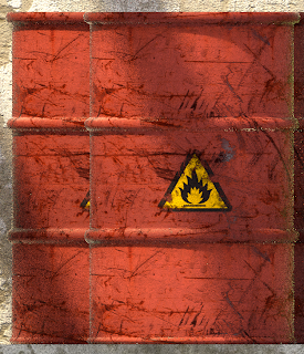
Figure 10. The decal appears like it should
with the correct UV map applied.


Credits: This example comes from a re-rendering of a scene from an Andrew Price's tutorial, but this time done with Cycles. Here are the results of using Blender Internal and Cycles.

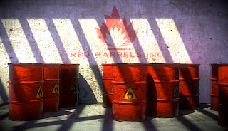
Blender internal plus compositing.

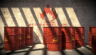
Cycles plus compositing.


Tuesday, February 7, 2012

La muse dans le tram - Review

I just discovered, through Blendernation's site, this new short film, titled La muse dans le tram (Muse on the Tram), written and directed by Alexander Volos, and starring Alexey Kireenko. As Volos' puts it:
This is my first film as a director. I and colleagues studied the possibility of a Blender and GIMP on this project. Film about the musician, who searches inspiration, listening to city sounds. Action occurs in the invented world of the retro-future.
Just the fact that open source tools were used on this project is remarkable, although it‘s becoming increasingly common—for example, see last year‘s Rosa, by Jesús Orellana. Besides the technical aspects, like a pretty perfect integration of CG and real footage, and a seemingly unending source of CG objects perfectly adapted to the theme, I think that the most interesting aspect of the film is the use of color gradation schemes (sepia tone) to define the mood.

Set in a steampunk-ish environment, with crazy transportation vehicles, and funny robots running around, the whole short focuses around aesthetics. There is not much to the story line. I think that better sound editing might have helped make the point about a musician drawing inspiration from the sounds around the city. However, just the experience of immersing oneself in the intriguing landscapes makes up for it. Overall, I'd give it four stars out of 5 (★★★★☆). Good job!


Friday, February 3, 2012

Subway Station - Compositing


Here's the latest render of my subway scene. I'm beginning to be pretty happy with the result. I added some compositing to it. The people were added in Photoshop, but the glares and other post processing touches were all done in Blender. The defocus was added as part of the compositing. To do this, you blur the image using the Z-depth map. In order to access the Z-depth information, you need to check the Z option in the Layers panel on the Render tab (see Figure 2).

Figure 1. Notice the depth of field effect, plus the different glares added
in the Compositor. Also, I added a slight vignette effect.

Figure 2. Checking the Z option in the
(render) Layers panels allows you to use the
Z-depth info—that is, the distance from the camera
expressed as a grayscale gradation.
Figure 3 shows what this looks like (untouched).

Figure 3. The information about Z-depth in grayscale representation.


Figure 4. This is the node setup I used here to add depth of field to the scene.
I tried to achieve a very subtle effect, because I feel that overdoing it ends up
making the whole scene look like it's really tiny (tilt shift effect).
The grayscale information of the Z map is fed into the Size slot of
the Blur node—that is, the blur gets applied 100% to the white areas in the image,
and the black areas get zero blur.